The difference between average and professional typesetting is all in the details – and one such detail that is often overlooked is hyphenation. Proper hyphenation is essential to a comfortable reading experience and clear communication.
In this article, we’ll take a closer look at how to use hyphenation to enhance your text. Let’s get started.
What is hyphenation?
Hyphenation is the act of dividing a word into two when it falls at the end of a line of text. We add a hyphen to signal that the word continues on the next line. Where a word is hyphenated usually depends on the justification (the alignment style preferred by both print and digital publications) settings.
Just a quick note: a hyphen ( – ) is not the same as an en dash ( – ) or an em dash ( — ).
A few rules for proper hyphenation
Proper hyphenation results in text that fits neatly into a space without compromising on readability. Poor hyphenation, on the other hand, can jar the reader, making it difficult to comprehend the text.
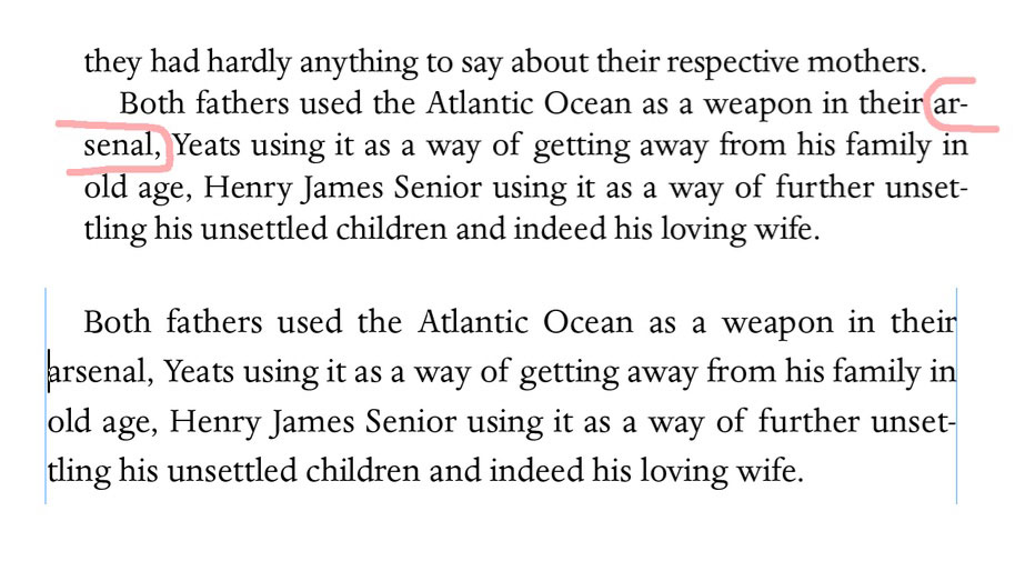
Ugly two-letter hyphenation (top) and how we fixed it (bottom)
Here are a few rules to follow to ensure your hyphens enhance rather than hinder the reader’s experience.
- Avoid having too many hyphenated line endings in the one paragraph. This applies even if the hyphenated words are not directly above or below each other.
- Avoid having two or more instances of hyphenation in a row.
- Avoid hyphenating right at the beginning or end of a word. One and two letter hyphenations just look ugly – see the example above.
- Examine the ‘rag’ (this is the right edge of the text) for any glaring or obvious holes, sloping edges, or words that simply stick out like a sore thumb. Ideally, the rag should form a subtle wave. If you know how to use hyphenation properly you can manufacture this effect.
- Ensure your text looks natural and uniform if it is justified. That means avoiding areas that are overly spaced or squeezed together. Again, you can use hyphenation to create an even, readable effect.
Never hyphenate in these circumstances
Now that you know the general rules for effective hyphenation, let’s take a look at a few specific examples of when not to use a hyphen.
First, never hyphenate words in titles, headings, subheadings, introductions, photo captions, labels or quotes. Because these are all short text elements, hyphenation will have no real benefit and can negatively impact readability.
Second, avoid hyphenating text that is justified in the centre unless it’s really, truly necessary. Again, centred text should only be used for short blocks of text, so it shouldn’t require hyphenation. Text that is right aligned also doesn’t look quite right when hyphenated.
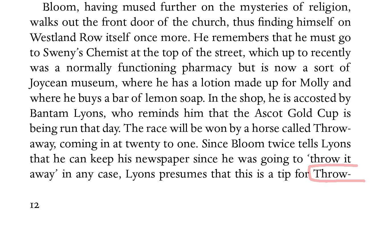
Finally, never hyphenate over the page break, as pictured above. By the time a reader turns the page, they may have forgotten the first few letters of the last word.
Invest in quality typesetting
You’ve worked hard on your manuscript or corporate publication, so give your readers the level of clarity and comfort they need to comprehend your text. Remember, poor typesetting can diminish the reader’s experience. Invest in high-quality, meticulous, attractive typesetting today. Find out more about our expert typesetting services.