Fonts and typefaces are one of those things we give little or no thought to in our everyday lives. They surround us daily, on street signs, billboards, movie posters, books, newspapers, sides of trucks and just about everything else we buy.
Here is a brief history of typefaces. Typefaces are now over 560 years old but until about 25 years ago we barely knew their names. With the everyday access to computers, both at home and at work, and their pull down font menus we have been made aware of the vast array of different fonts available to us.
Steve Jobs brings fonts to our attention
After one paid semester at University in 1972, Jobs spent 18 months hanging out at Reed University studying Calligraphy. His professor was the ex-trappist Monk, Robert Pallandio.
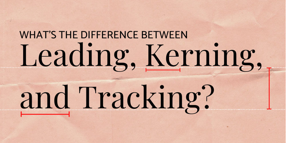
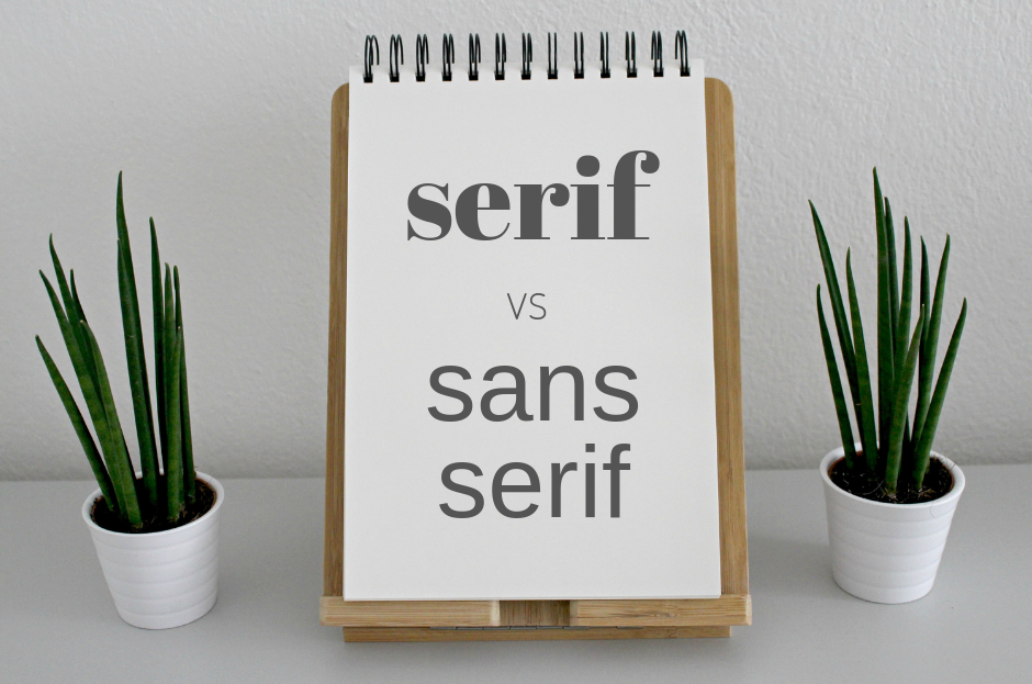
“I learned about serif and san serif typefaces, about varying the amount of space between different letter combinations, about what makes great typography great. It was beautiful, historical, artistically subtle in a way that science can’t capture, and I found it fascinating.”
— Steve Jobs
When Jobs designed his first Macintosh computer, it came with something unprecedented for this time – a wide range of fonts. This range included familiar types such as Times New Roman and Helvetica. Jobs also introduced new designs and seemingly took great care in their appearance and naming. They were named after cities he loved – Chicago and Toronto.
His desire was for each of them to be as distinct and beautiful as the calligraphy he had studied a decade earlier. The fonts Venice and Los Angeles were designed with a handwritten look to them.
The shift in our relationship with fonts and typefaces
This was the beginning of the shift to where the everyday person had a relationship with letters and type. Previously that had been the domain of those with a technical knowledge in the design and print trade.
Jobs’s fonts are not easy to find these days as they are coarsely pixelated and cumbersome to manipulate. But in the mid 1980s and early 90s the ability to change fonts was like technology from a science fiction movie.
Prior to 1984 all the layman had on offer was the dull typefaces of the manual typewriter, if you were very flash an electric typewriter or a very primitive mainframe computer. In the beginning Apple used Chicago (not on the drop down menu any longer) for all its menus and dialogues on screen, right through to the time of the early ipods. IBM and Microsoft would soon follow suit.
This is a time that marked a freedom from the physical demands of printing and the frustrations of rubbing a sheet of Letraset. Leading to a change in our relationship with words and our creative expression through playing with word design.
Today there is nothing simpler than pulling down the font menu and choosing a font. What makes us choose one font over another? What impression are we trying to create? What are we really saying?
We live in healthy typographical times, the font is here to stay. Steve Jobs and his digital rivals brought about a world where we are individual masters of type. One where we are now more aware than ever of fonts.
To discuss your love of fonts and typefaces contact us.