 Fonts convey various moods. Some appear more professional and conservative. Others evoke a sense of playfulness.
When it comes time to typeset your publication – whether that be a printed novel, self-published eBook, or corporate document – selecting the correct typeface is critical. Choose the wrong one, and you could distract, confuse, or mislead your reader.
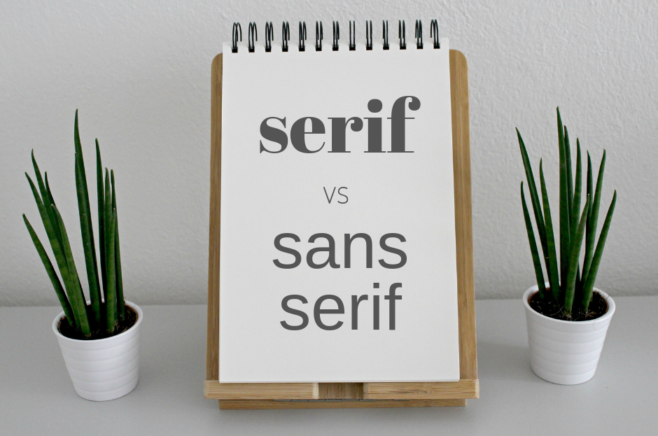
In this guide, we’ll take an in-depth look into the two major families in typography: serif and sans serif. Let’s get started.
Serif type family
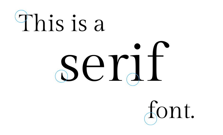
What’s the difference between serif and sans serif typefaces? Serif fonts have little foot-like accents called serifs. Typically, serif fonts appear more serious and traditional.
The origin of serif fonts dates back centuries – well before the world-changing printing press was introduced. Back in the day, stonemasons carved Latin letters into stone. Before the carving process began, letters were mapped out on the stone using a paintbrush. The carving would start just outside of the painted letters, creating a little notch. And that’s what we now call a serif.
Serif typefaces are broken down into four distinctive families.
1. Old Style
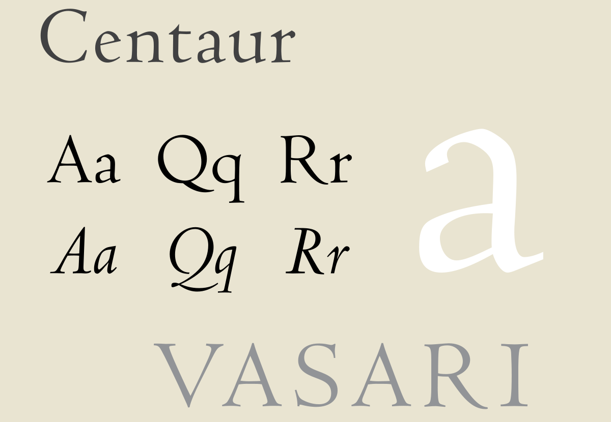
As the name suggests, this family includes the oldest serif typefaces, many of which were created to replicate what text looked like in the 15th century. Old style fonts include Centaur and Goudy Old Style.
2. Transitional
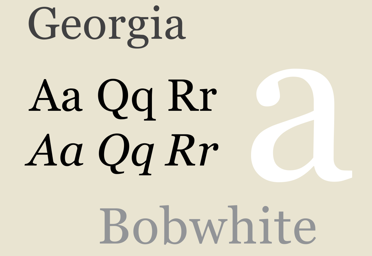
A little more modern looking, the transitional family includes some of the most-used serif typefaces: Georgia, Baskerville and Times New Roman.
3. Modern
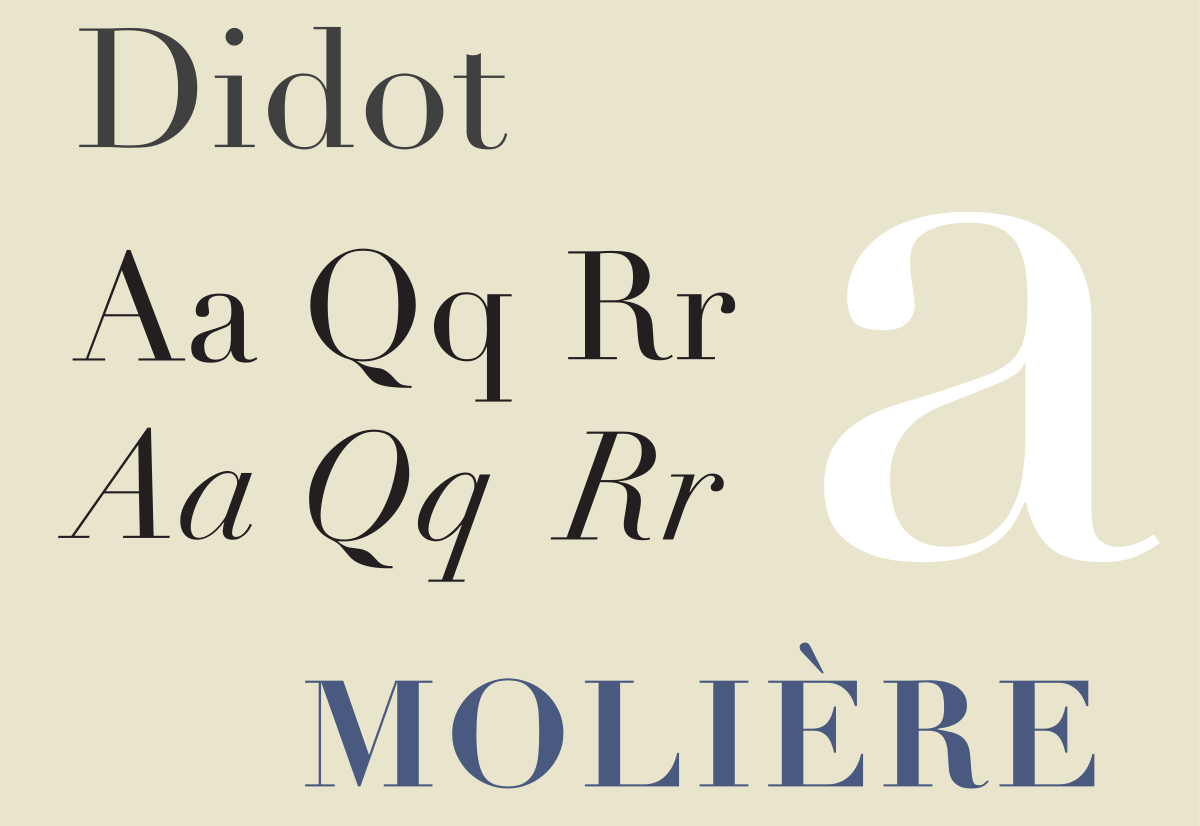
These typefaces are clean, classy and contemporary. Didot, the typeface used for the title of Vogue Magazine, is an example of a modern serif font.
4. Slab-serif
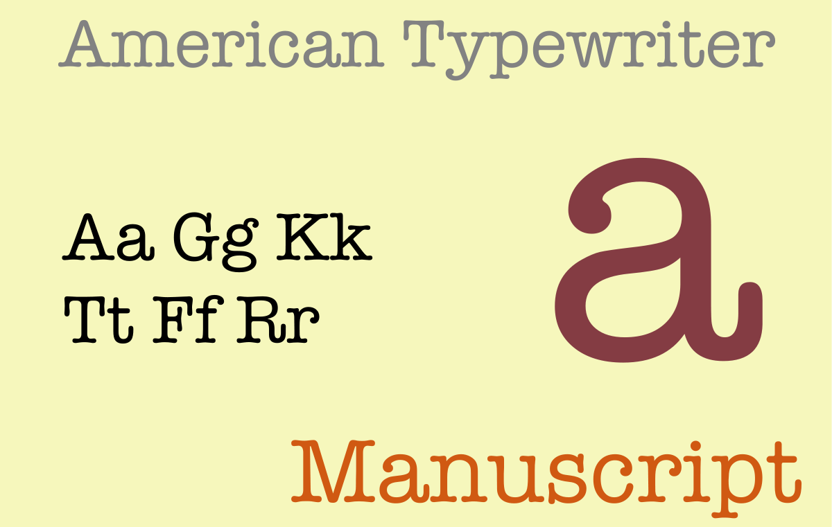
Slab-serifs include typefaces with extremely thick serifs. This includes American Typewriter and Archer.
Sans serif type family
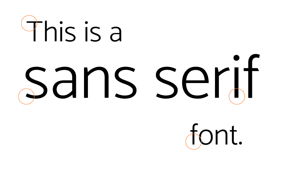
Sans serifs do not have the serif feature. In fact, they are completely devoid of any decorative elements along the top bars and central beams. Sans serif typefaces have a contemporary edge, especially those with a lot of open space.
Sans serif fonts are also divided into four families.
1. Grotesque
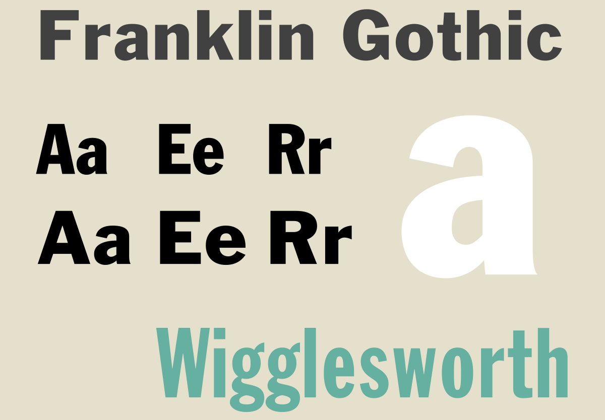
Grotesque fonts are the oldest of the sans serifs. This family includes Franklin Gothic and New Gothic.
2. Neo-Grotesque
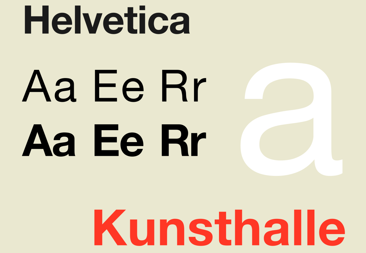
A little more modern than the grotesque family, neo-grotesque fonts include some of the most popular typefaces: Helvetica and Arial, for example.
3. Humanist
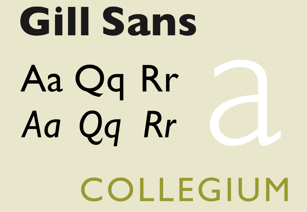
Humanist fonts are even more contemporary. Here, you’ll start to see variations in modulation. Gill Sans is an example.
4. Geometric
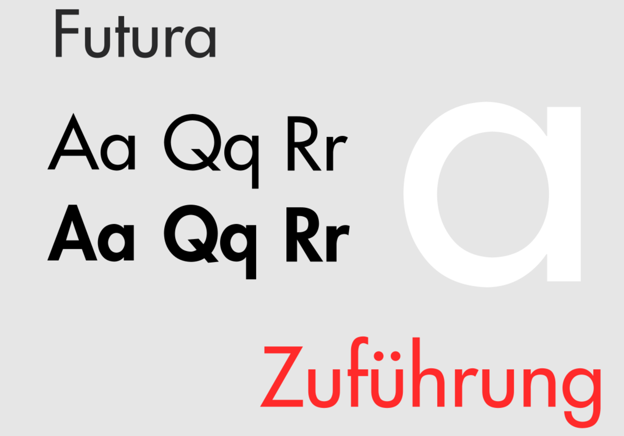
This family includes typefaces designed to mirror the curves and lines of geometric shapes. One way to identify a geometric font is to look at the letter O – it’s always perfectly round. Futura is a fantastic example.
Selecting the right font
Typefaces are fascinating examples of practical design. But when it comes to publishing your text, the most effective typefaces are both attractive and highly legible.
If you’d like help making the right typesetting decisions – such as which font to use, how to layout your text, and when to include visual elements – please get in touch. Our team would be more than happy to help make your next publication a success.