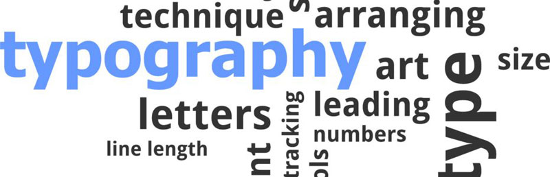
 The typesetting process is complex and varied. Typesetters must contend with a whole host of different elements: typeface, type size, hyphenation, justification, white space, illustrations, margins, and more. Leading, kerning, and tracking are three lesser-known elements that play a significant role in the overall look of the finished product.
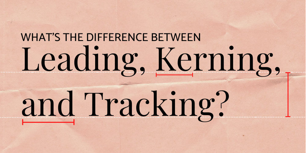
In this article, we’ll explain what leading, kerning, and tracking are and how they impact readability. Let’s jump right into it.
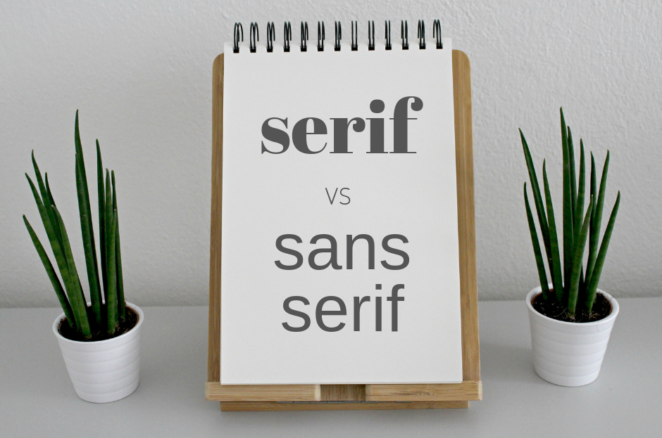
What is leading?
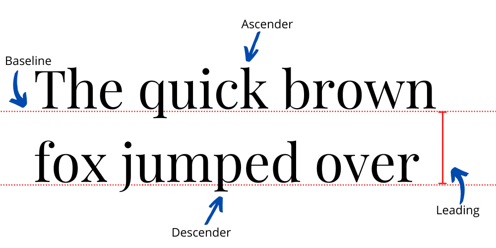
Leading determines how text is spaced vertically. When arranging content that has more than one line of text (like this blog post), typesetters must make sure that the distance between each line is sufficient to make them legible.
Leading is measured from what’s known as the baseline – essentially where the letters sit. When determining the leading, it’s crucial to account for descenders and ascenders:
- Descenders are letters that contain features that sit below the baseline, such as a lowercase y.
- Ascenders are letters that have taller features, such as a t.
Leading is typically set to be 20 per cent larger than the type size. However, some fonts may require a different distance.
What is kerning?
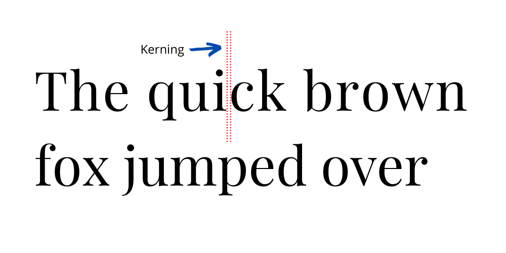
Kerning also relates to space, but instead of vertical distance, it’s the distance between two letters. If the kerning is too short, words can become indecipherable. Set too far apart, and the text becomes awkward to read. Worse of all, inconsistent kerning (text in which some letters are close together, and others are far apart) can be extremely frustrating to read.
Successful kerning requires proportional spacing between letters. Serifs and stylistic flourishes must be accounted for, making the process more difficult than you might think. It takes a keen eye and years of practice to master the fine art of kerning.
What is tracking?
Tracking is sometimes confused for kerning, but it’s actually quite different. Where kerning involves the spacing between two letters, tracking involves the spacing throughout the entire word. In practice, a typesetter will first set the kerning and then, with great restraint, adjust the spacing equally between all letters simultaneously.
Adjustments to tracking are usually made to better fill a space or to make a single word appear light, airy, and important. It’s worth noting that playing around with tracking can fast sabotage your text’s readability – be very, very careful when making changes.
Leave it up to the professionals
Most people have no idea just how much time, effort, and attention to detail goes into preparing a manuscript or corporate document for publication. Leading, kerning, and tracking are just three elements of many.
The best way to ensure your text is enjoyable and comfortable to read is to hand it over to a trusted team of professional typesetters. Get in touch with us today to find out more.