Whether you are typesetting a cookbook, a kids’ book, or a corporate publication, choosing a suitable font is imperative. Fonts have a significant impact on how a reader perceives a text – the wrong font will not only make text tough to read, but can also twist your message, give the wrong impression, and result in ineffective communication.
In this article, we’ll look at five font crimes you should never commit.
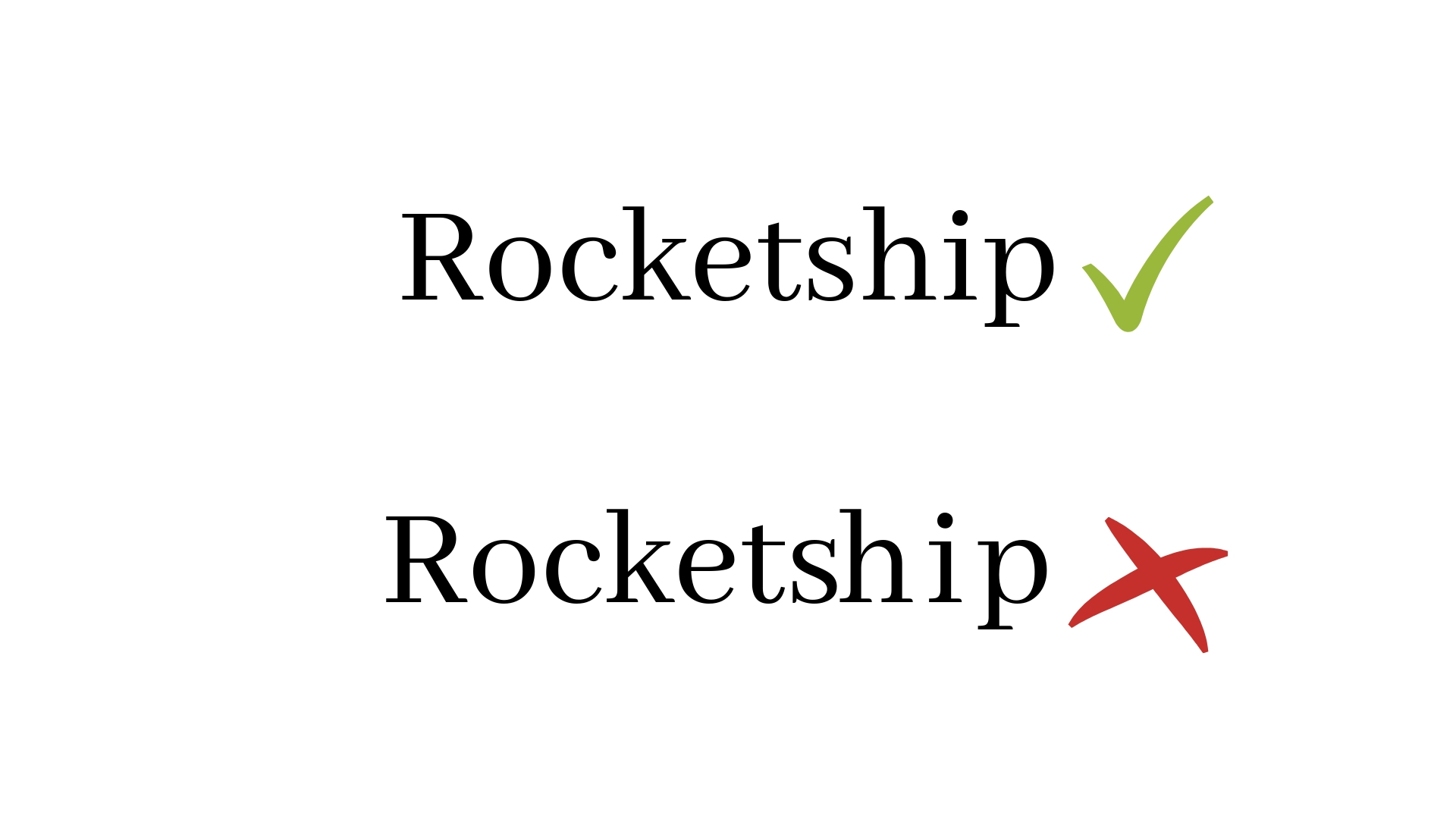
1. If using script, never use uppercase

With their flowing, almost handwritten appearance, script fonts can be used effectively in the right context, especially in graphic elements of a text. Just remember to never, ever use script fonts in uppercase.
Why? Because it’s extremely difficult to read. What’s more, the urgency or exclamation conveyed by uppercase letters clashes with the romantic or personal tone offered by script fonts.
2. Always select an appropriate font

Excellent typesetting aims to make a text readable, ensuring the writer’s message is communicated clearly and without distraction. Selecting an appropriate font is a vital step in this process.
For example, if you are publishing an annual report an embellished or script font isn’t going to convey a sense of professionalism. On the other hand, if you are creating a text for children or aiming for a more playful reading experience you can be a little more experimental when choosing a font.
3. Always pay attention to kerning
One mistake we see time and time again from poor typesetters is a failure to pay attention to kerning. Kerning refers to the spacing between each character. Some free fonts come with terrible, uneven kerning, so you’ll need to make these adjustments manually to ensure your text is visually appealing and easy to read.
4. Avoid tracking on script fonts

Here’s another no-no when it comes to using script fonts: increasing the space between each character, also known as tracking. Script fonts are designed to look handwritten, and many are carefully created to ensure each character joins or fits nicely with the previous character.
Adding distance between individual characters just looks strange and, again, can make it tricky to read.
5. Choose fonts that are easy to read
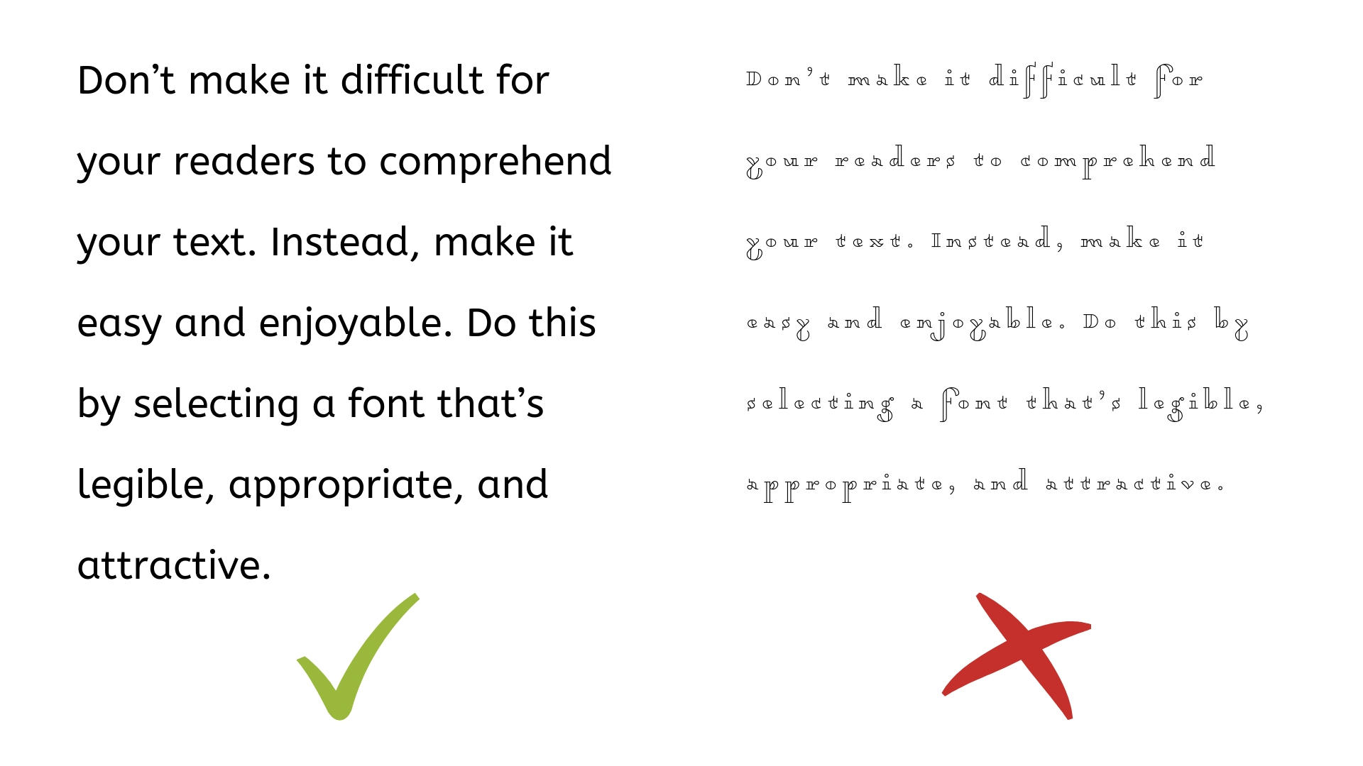
When it comes to body text and other longer text elements, readability is the key to effective communication. Avoid all-caps fonts, script fonts and other embellished typefaces. These are incredibly difficult to read and tend to distract the reader from your message.
Invest in quality typesetting
You’ve put hours of work into creating your text. The next crucial step is to ensure your readers can comprehend it without any presentation or font distractions.
Invest in top-quality, meticulous and attractive typesetting with the team at Post Pre-press Group. Get in touch on (07) 3395 2022 to find out more about our typesetting services today.